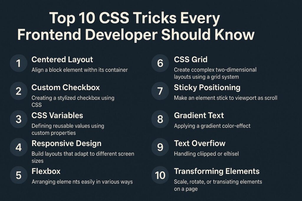
CSS is the backbone of web design. Mastering it takes more than just knowing syntax—you need real-world techniques that enhance usability, responsiveness, and aesthetics. Whether you’re a beginner or an experienced developer, these CSS tricks will upgrade your frontend skills.
1. Center Anything with Flexbox
Vertical and horizontal centering used to be tricky. With Flexbox, it’s clean and effortless.
.parent {
  display: flex;
  justify-content: center;
  align-items: center;
  height: 100vh;
}
Use Case: Centering modals, loaders, content blocks.
2. Create a Responsive Aspect Ratio
Preserve image or video ratios on all screen sizes using aspect-ratio or padding trick.
.container {
  aspect-ratio: 16 / 9;
  width: 100%;
  background: lightgray;
}
Fallback (for older browsers):
.container {
  position: relative;
  padding-top: 56.25%; /* 16:9 */
}
.container > iframe {
  position: absolute;
  top: 0;
  left: 0;
  width: 100%;
  height: 100%;
}
3. Smooth Scroll Behavior
Add smooth scrolling for anchor links or SPA navigation.
html {
  scroll-behavior: smooth;
}
Use Case: Enhances user experience on long pages with anchor jumps.
4. Custom Scrollbars
Style scrollbars in modern browsers for a more polished look.
/* Chrome, Edge, Safari */
::-webkit-scrollbar {
  width: 8px;
}
::-webkit-scrollbar-thumb {
  background-color: darkgray;
  border-radius: 4px;
}

/* Firefox */
scrollbar-color: darkgray transparent;
scrollbar-width: thin;
Use Case: Branded UI and better accessibility.
5. Use :is() for Cleaner Selectors
Simplify complex selectors using :is().
:is(h1, h2, h3, h4, h5, h6) {
  font-family: 'Open Sans', sans-serif;
}
Why It Helps: Reduces repetition and improves maintainability.
6. Text Truncation (Ellipsis)
Handle long text overflow in UI (like product names or titles).
.truncate {
  white-space: nowrap;
  overflow: hidden;
  text-overflow: ellipsis;
  width: 200px;
}
Bonus: Use -webkit-line-clamp for multi-line truncation.
.clamp {
  display: -webkit-box;
  -webkit-line-clamp: 2;
  -webkit-box-orient: vertical;
  overflow: hidden;
}
7. Maintain Image Aspect Ratio with object-fit
Prevent image distortion by maintaining aspect ratios inside containers.
img {
  width: 100%;
  height: 100%;
  object-fit: cover;
}
Use Case: Responsive cards, gallery layouts, hero images.
8. Responsive Typography with clamp()
Create scalable, fluid text that adapts to screen size without media queries.
h1 {
  font-size: clamp(1.5rem, 5vw, 3rem);
}
Why It’s Great: Automatically adjusts typography from mobile to desktop without breakpoints.
9. CSS Variables for Theming
Use :root variables for consistent, manageable styling.
:root {
  --primary-color: #2f80ed;
  --font-size: 16px;
}

button {
  background-color: var(--primary-color);
  font-size: var(--font-size);
}
Use Case: Theming, dark mode support, dynamic styling.
10. Animation with Keyframes
Add subtle interactions and motion to enhance UX.
@keyframes fadeIn {
  from {
    opacity: 0;
    transform: translateY(20px);
  }
  to {
    opacity: 1;
    transform: translateY(0);
  }
}

.element {
  animation: fadeIn 0.6s ease-in-out;
}
Use Case: Entrance animations, hover effects, loading screens.
Bonus: Mobile-First Media Queries
Build for mobile first and scale up:
/* Base (mobile-first) */
.container {
  padding: 1rem;
}

/* Larger screens */
@media (min-width: 768px) {
  .container {
    padding: 2rem;
  }
}
Why Mobile-First Matters: Ensures your site works on the most constrained environments first.
Final Thoughts
Mastering CSS is about more than memorizing properties—it’s about understanding patterns, anticipating user needs, and delivering responsive, accessible, and maintainable designs. These tricks are not just “nice to know”—they are the foundation of modern frontend development.
Start incorporating these into your workflow, and your UI code will become more powerful, reusable, and professional.

I’m Shreyash Mhashilkar, an IT professional who loves building user-friendly, scalable digital solutions. Outside of coding, I enjoy researching new places, learning about different cultures, and exploring how technology shapes the way we live and travel. I share my experiences and discoveries to help others explore new places, cultures, and ideas with curiosity and enthusiasm.


